A heritage
brand, weak
shelf unity
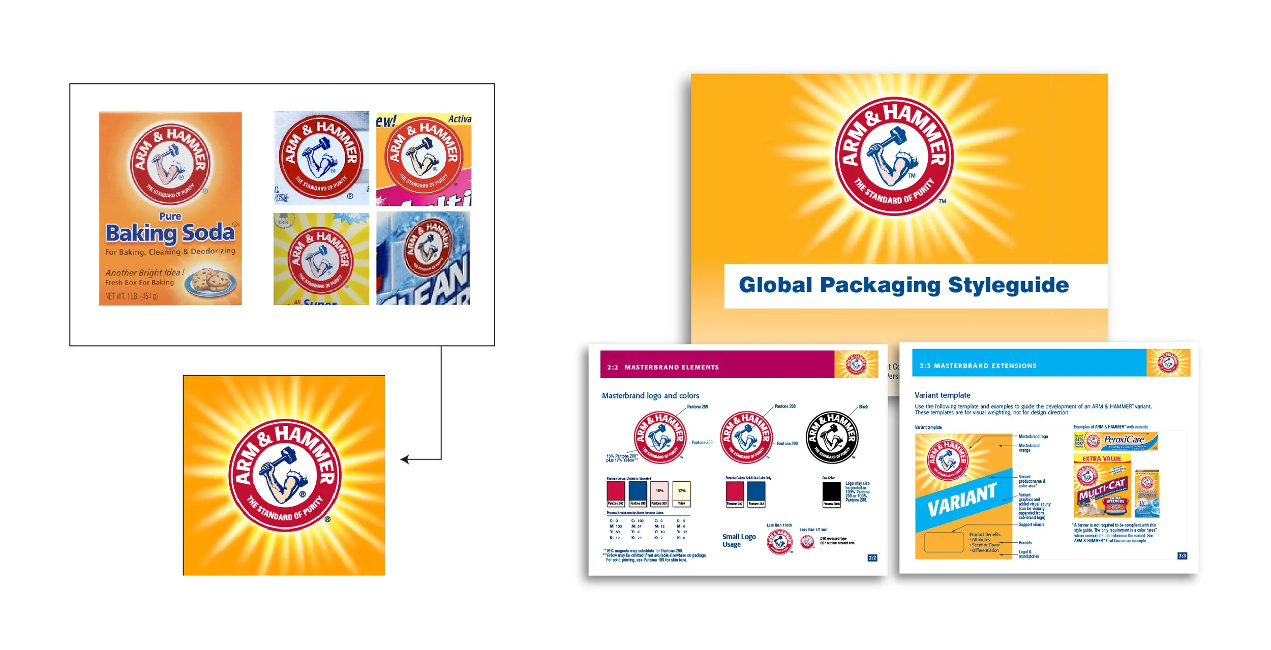
Arm & Hammer was founded in 1874 on the humble power of baking soda and is one of America’s greatest brands. Over the years consumers championed this miraculous powder to do a multitude of household tasks. Eventually the brand converted these homemade formulas to real products such as: toothpaste, laundry detergent, deodorant, and a dozen other categories. The wide range of categories extended the brand so broadly that it diluted the masterbrand visual equity.
Masterband unification
An extensive visual equity study resulted in a global masterbrand design that returned the brand to its visual roots. A global style guide was introduced that visually controlled all the packaging on shelf. It tightly regulated new packaging design moving forward so that each group and subsidiary that touched the brand could not dilute it.
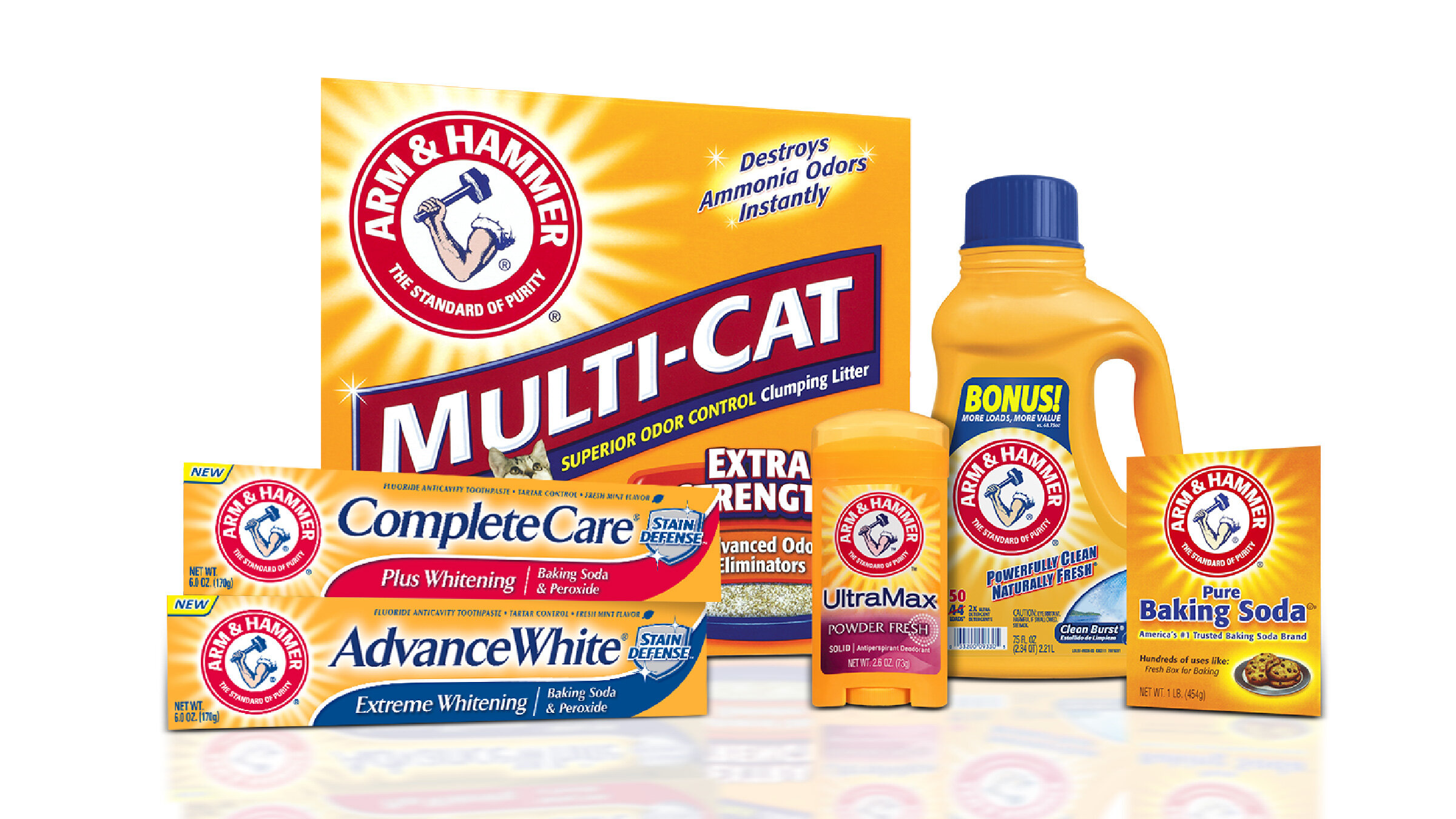
This design unified Arm & Hammer visually and enabled customers in one category to be able to recognize it, and purchase it in another. Redesigns were ultimately rolled out in over 20 shopper categories, (and still counting!).
Oral care category
The oral care was the first category to be redesigned and this quirky product was transitioned into a premium oral care brand. The Spinbrush brand was transitioned away from Crest to be a co-branded Arm & Hammer.
Natural laundry detergent
Arm & Hammer is uniquely situated to create a natural detergent that was natural and effective. This design called for a effective blend of green and power.
Antiperspirant
Arm & Hammer deodorant has always had a strong masculine overtone. This new design for antiperspirant enabled the marketing of specific scents separately to women and men.
Green cross-category sub-brand
Arm & Hammer wanted to develop a cross-category “green” brand. We developed a sub-brand name and identity that communicated true, green power.
Endorsing brands in pet care
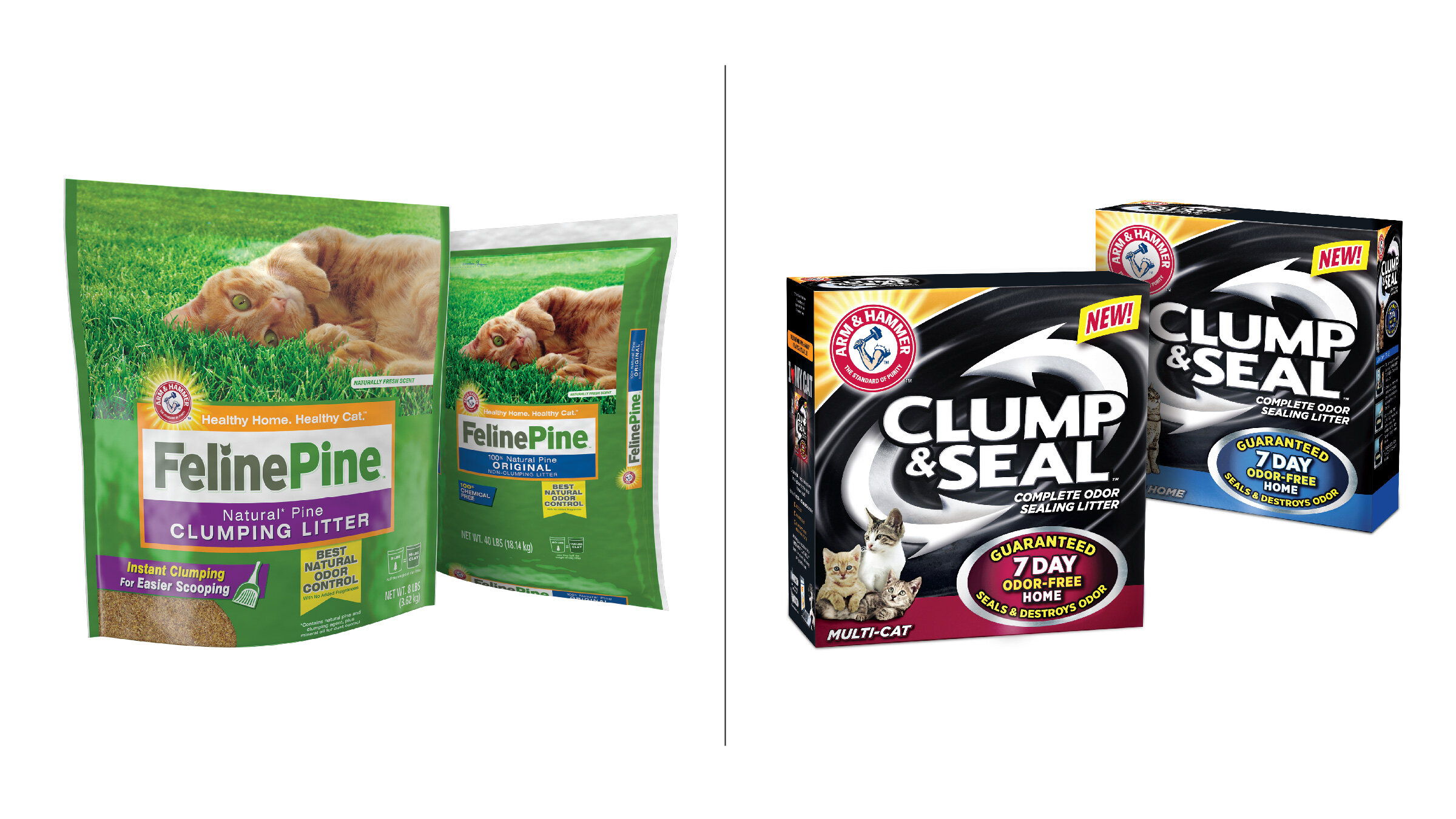
Arm & Hammer developed category-specific sub-brands when it’s equity was better used as an endorsing mark. This also allowed a stretching of the equity into visual areas that would be more effective to certain target audiences. Below are two examples of this endorsing relationship in natural and performance cat litter.
Website & social media
The Arm & Hammer masterbrand website was redesigned to match the global unification look. Social media was also part of the effort for pet care on Instagram & Facebook.


