Blowing
up a dusty
category
Camacho cigars brand redesign
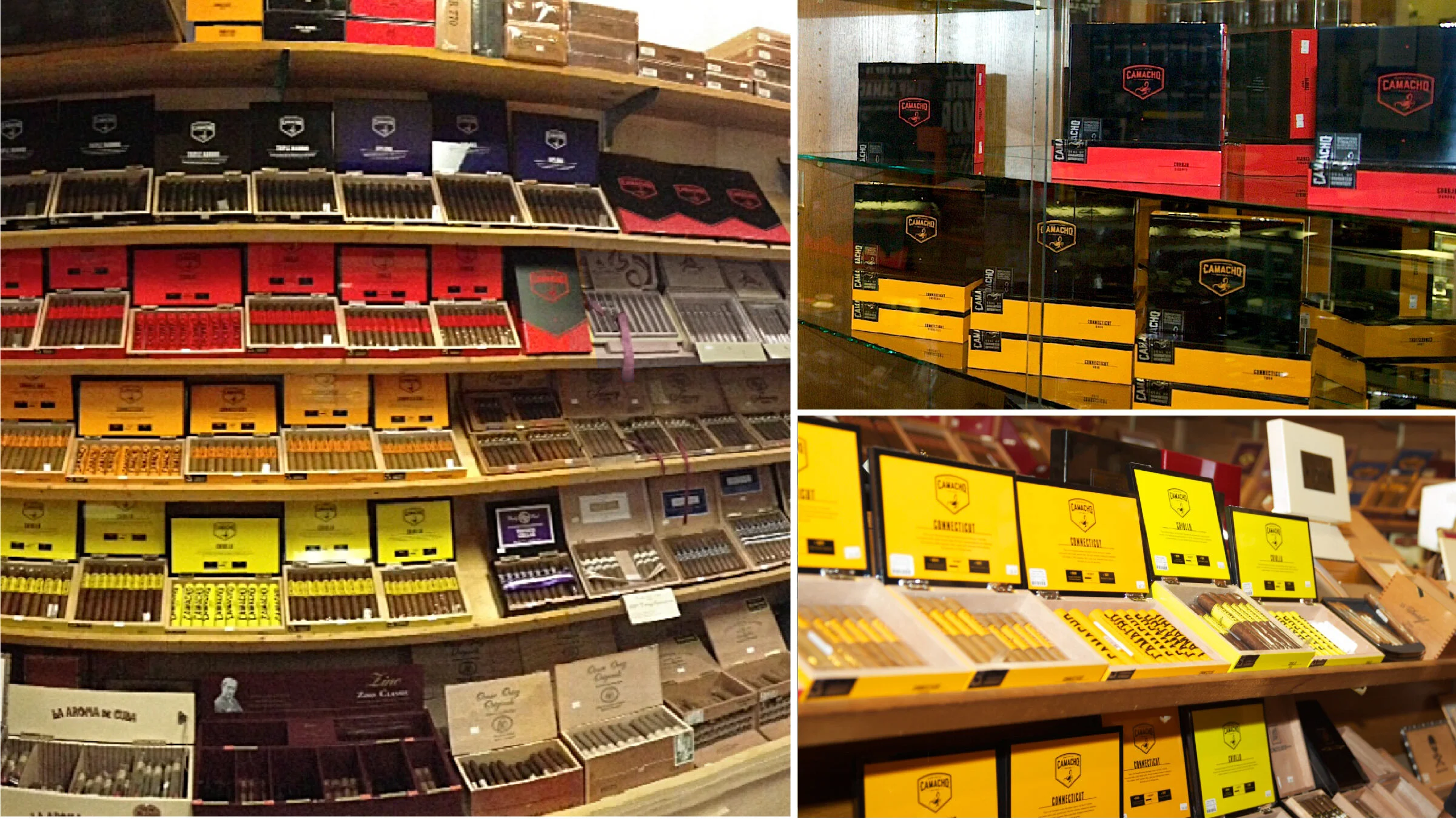
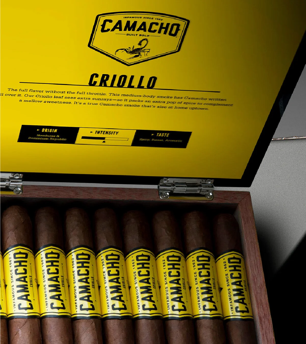
When our redesigned Camacho packaging hit cigar stores, it was a seismic-detonation to the brown, sleepy-shelves filled with sameness. Our bold redesign exploded the category and led to remarkably increased sales, (over 2,000% in some cities and 250% globally), and in positioning Camacho as the brand for the young and the bold. The new identity relied on a new brand mascot: A scorpion – a hostile arachnid that patrols tobacco fields at night, (and terrifies workers from being in the fields past sundown). By using vibrant bold colors and rich blacks, the brand jumped off the shelves and solidified itself as a major player in this luxury category.
Point-of-sale and trade show booth
The attitude of the scorpion was carried forward into point-of-sale design and a global trade show booth. The scorpion came alive in numerous treatments and iterations, all designed to leverage the core truth of the brand: Camacho is for the bold.
Limited edition packaging
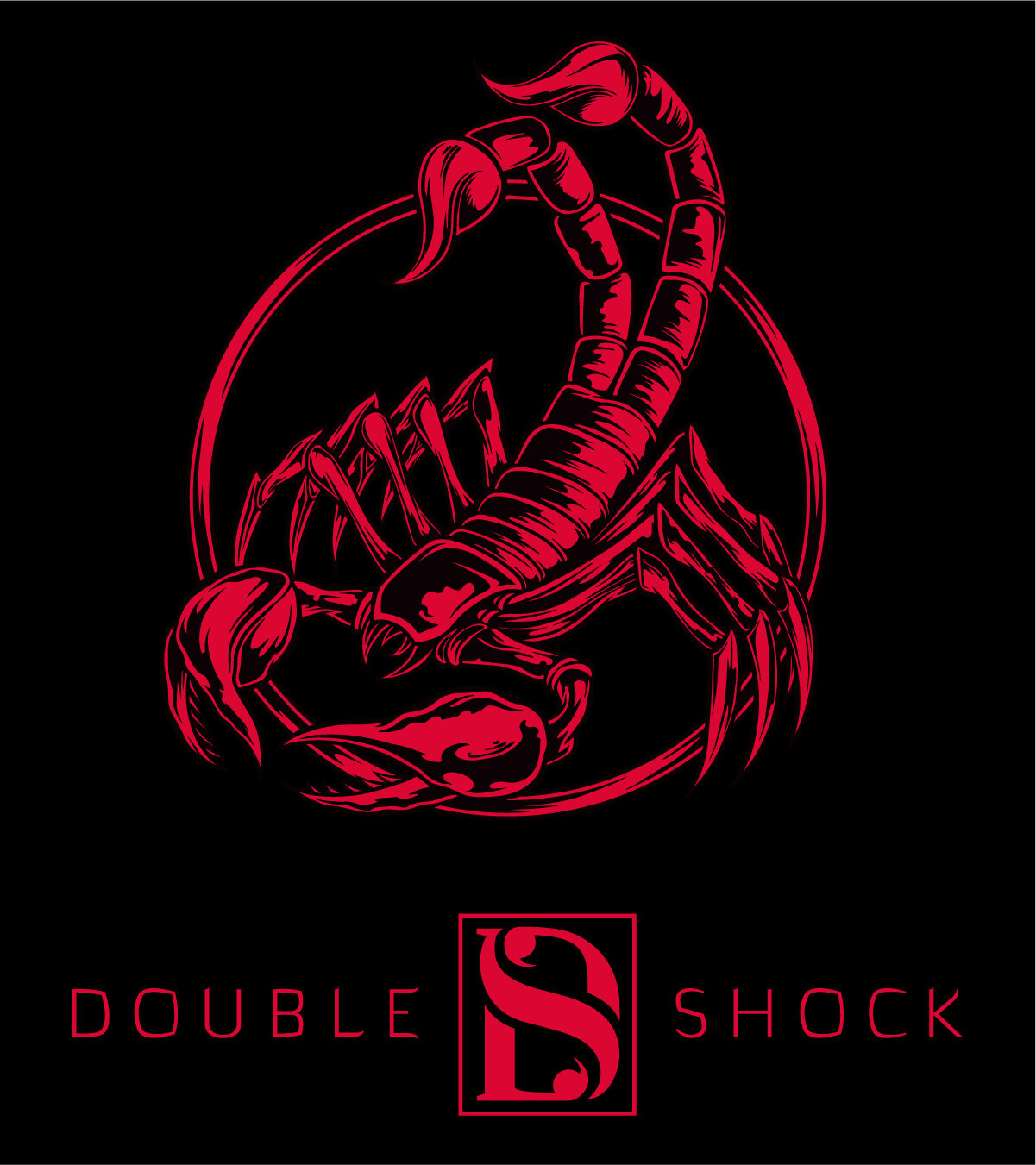
Limited editions were created every year to supplement the core line and to create collectables for fans. Blackout was launched to further build on the concept of darkness and night being the realm of scorpions. B.J. Meyer and double shock were one-time-only brands launched with exclusive gift with purchases, packaging materials, and brand content. Each used extensive discovery elements and easter egg graphics to further connect with the consumer.


