A Green
Leader
Lost On
Shelf
Problem: Recessive packaging
Despite the leadership position of the brand, Seventh Generation packaging was lost on shelf and hard to find. Generic store-brands had much higher visual impact. Although the brand was one of the first green companies to use a ‘leaf’ on its package, extensive copy-cat brands also had leaves which diluted its ability to break through at shelf.
Identity exploration
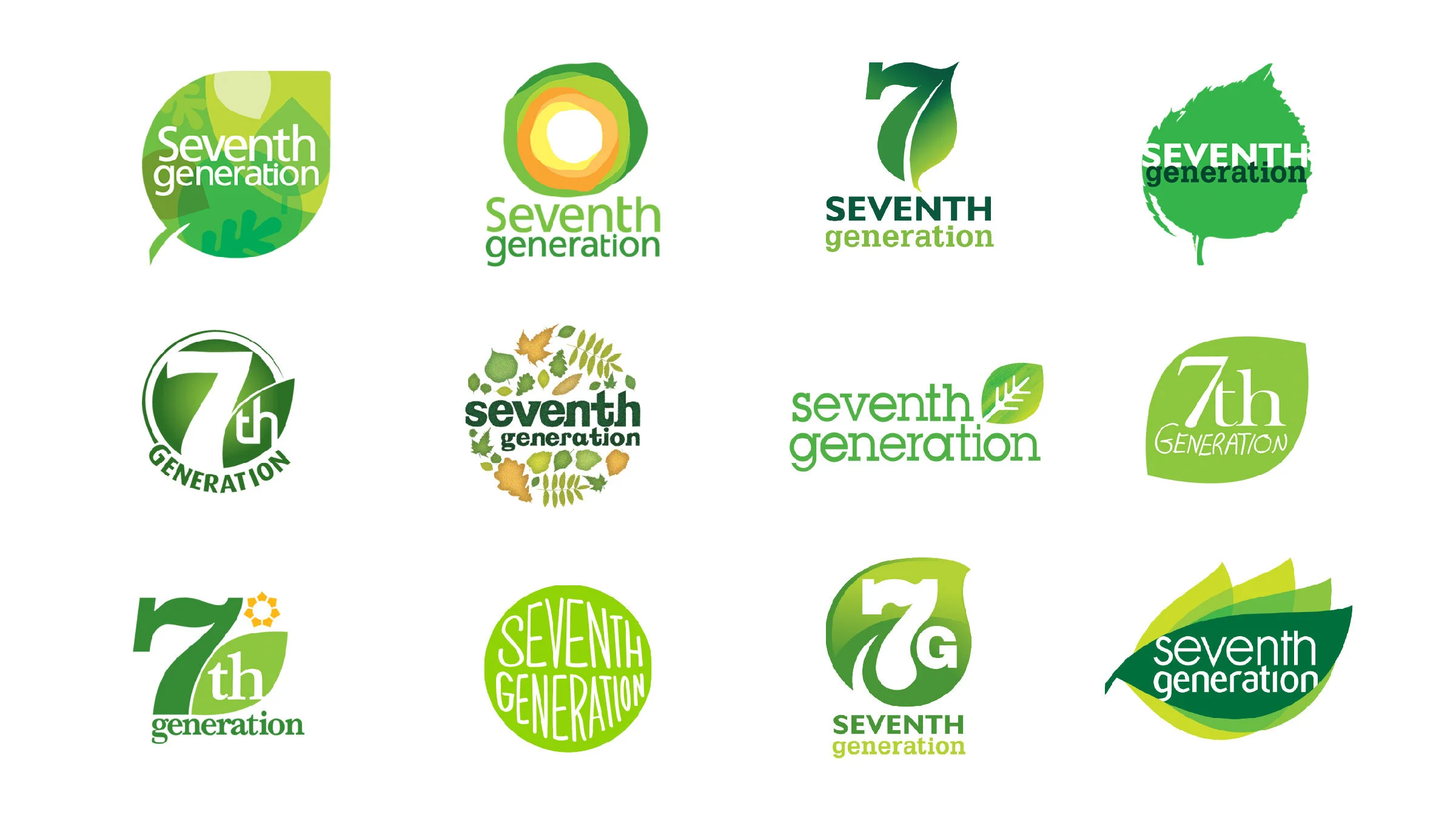
We explored a wide variety of revolutionary and evolutionary identity marks. Naming options were also explored to potentially shorten the name.
Package structure
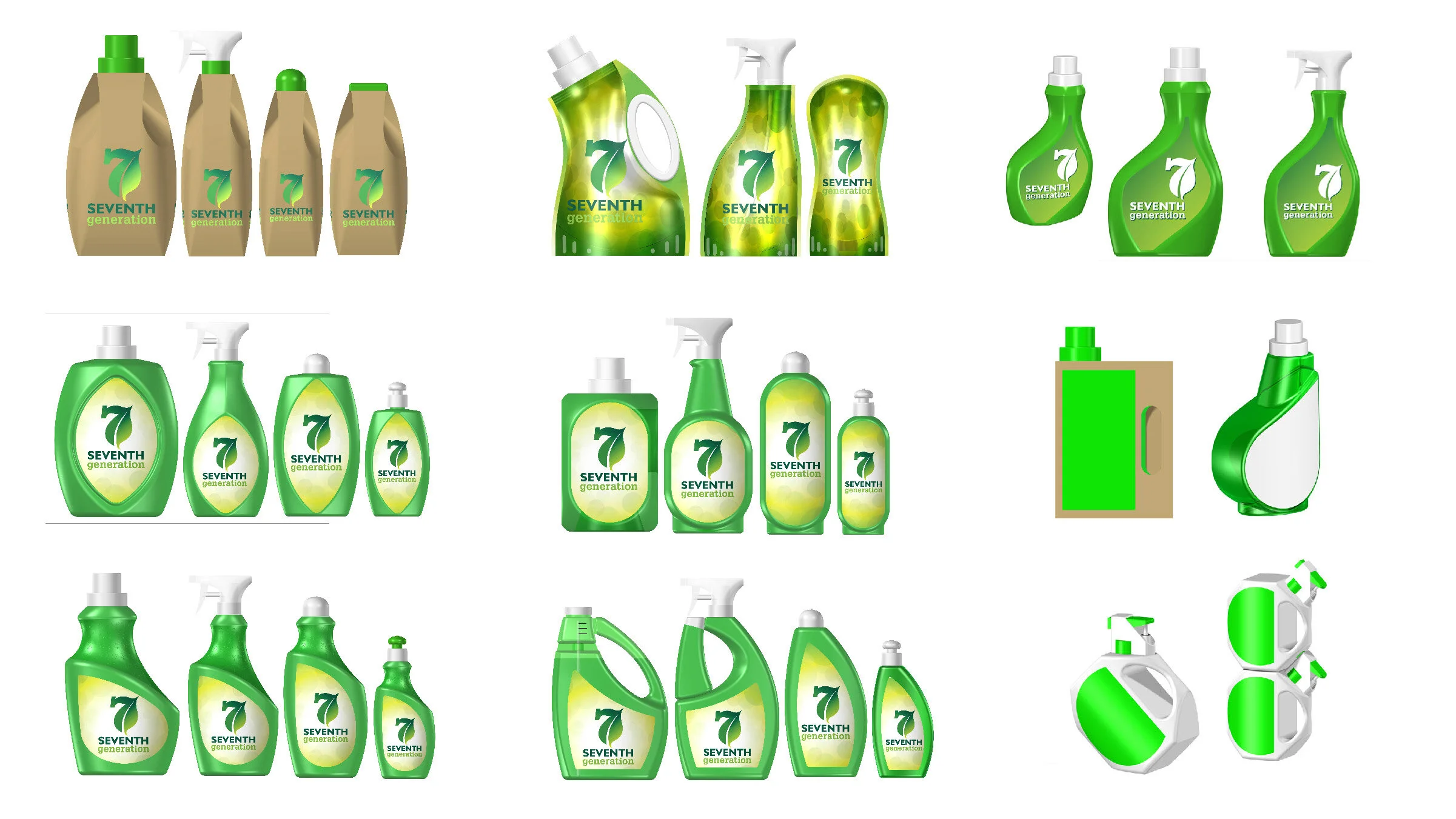
The package structure was explored to give the brand a distinct form and usage impression on the shelf. Materials and functions were also explored to instantly communicated the green credentials of the brand.
Package graphics
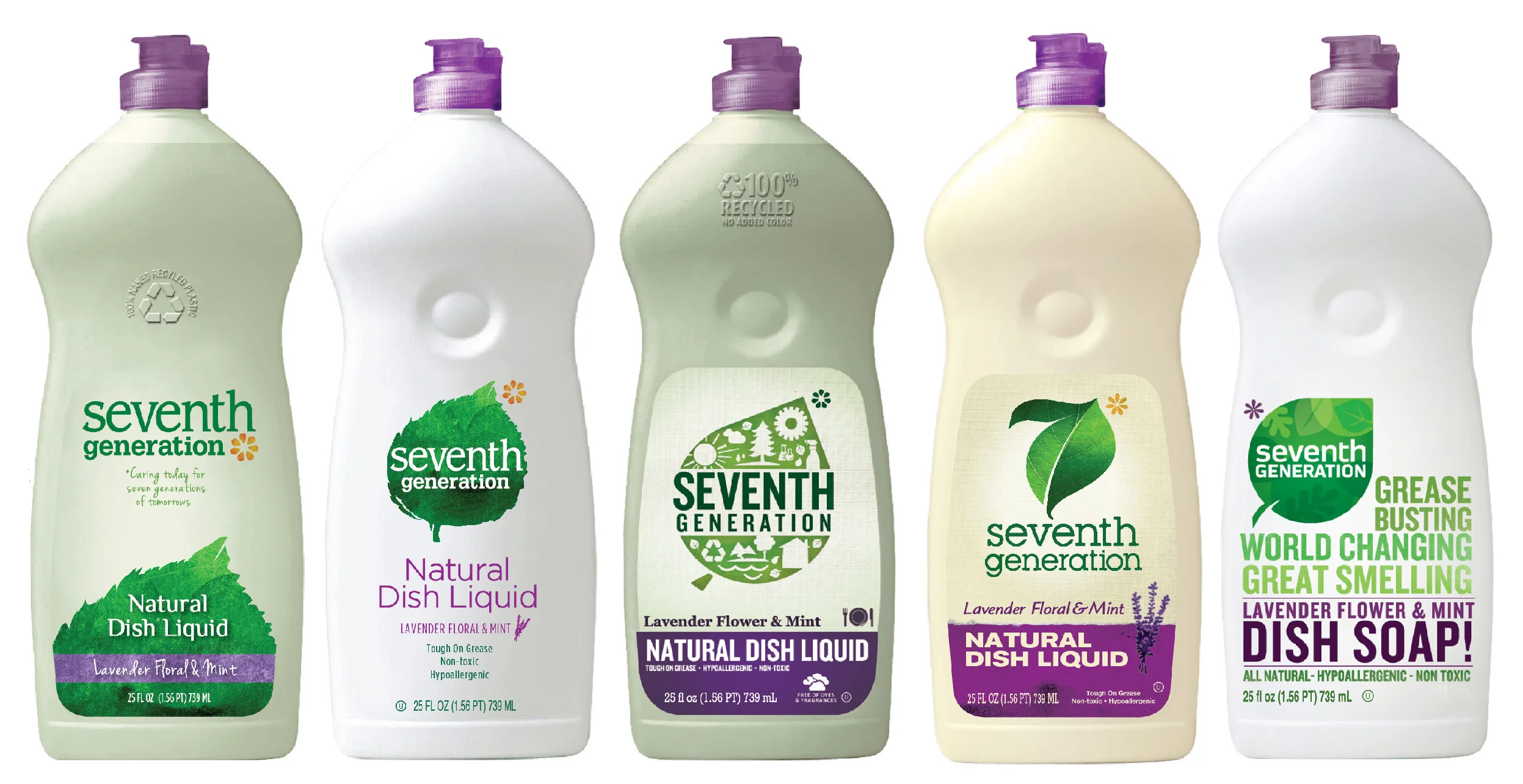
A package graphic exploration tested a variety of identities, persona’s, and bottle colors with consumers.
Final identity with new leaf
Consumers selected the above logo for the final packaging. A hand-painted leaf was painted by Vermont artist Peter Huntoon. A telegraphic explanation for the name of the company was developed so consumers better understood the mission and personality of the brand.
Final packaging
The final packaging increased shelf-impact, modernized the brand, and elevated the leaf emblem to an ownable symbol. Many of the bottle structures included an embossed leaf accent as well. Recycling information was put directly on the front of each bottle to let consumers know (before purchase) how much recycled content was in each bottle.


